iD Tech
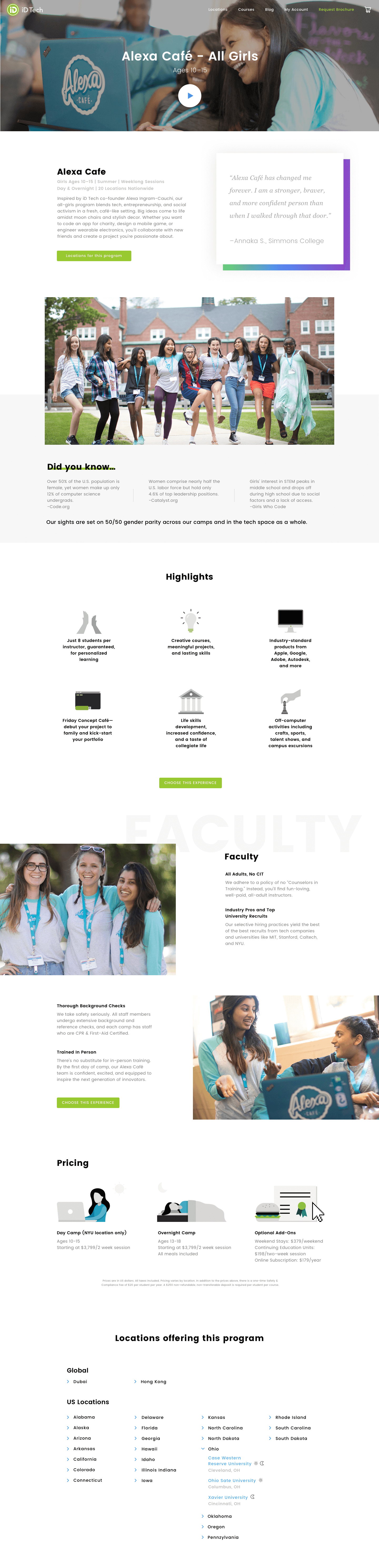
At iD Tech, kids and teens of all skill levels discover coding, AI, machine learning, video editing, robotics, and game design, developing the in-demand skills needed to compete at startups, non-profits, and titans like Google, EA, Facebook, and Apple.
Challenges
• Too many options make it hard to choose the right course
• Parent's didn't understand the lingo and certain tech terms
• Couldn't register more than one student at a time
• Couldn't register multiple courses for one student
• Too many CTA's would confuse the visitor
• Visitor did not feel comfortable with the high price point
• The value of the camp was not clear
• Confused between the different programs offered
Role & Responsibilities
- Set vision and goal over cross-functional team
- Led the redesign of an e-commerce website responsible for 90% of the company's revenue and overlooked implimentation of designs.
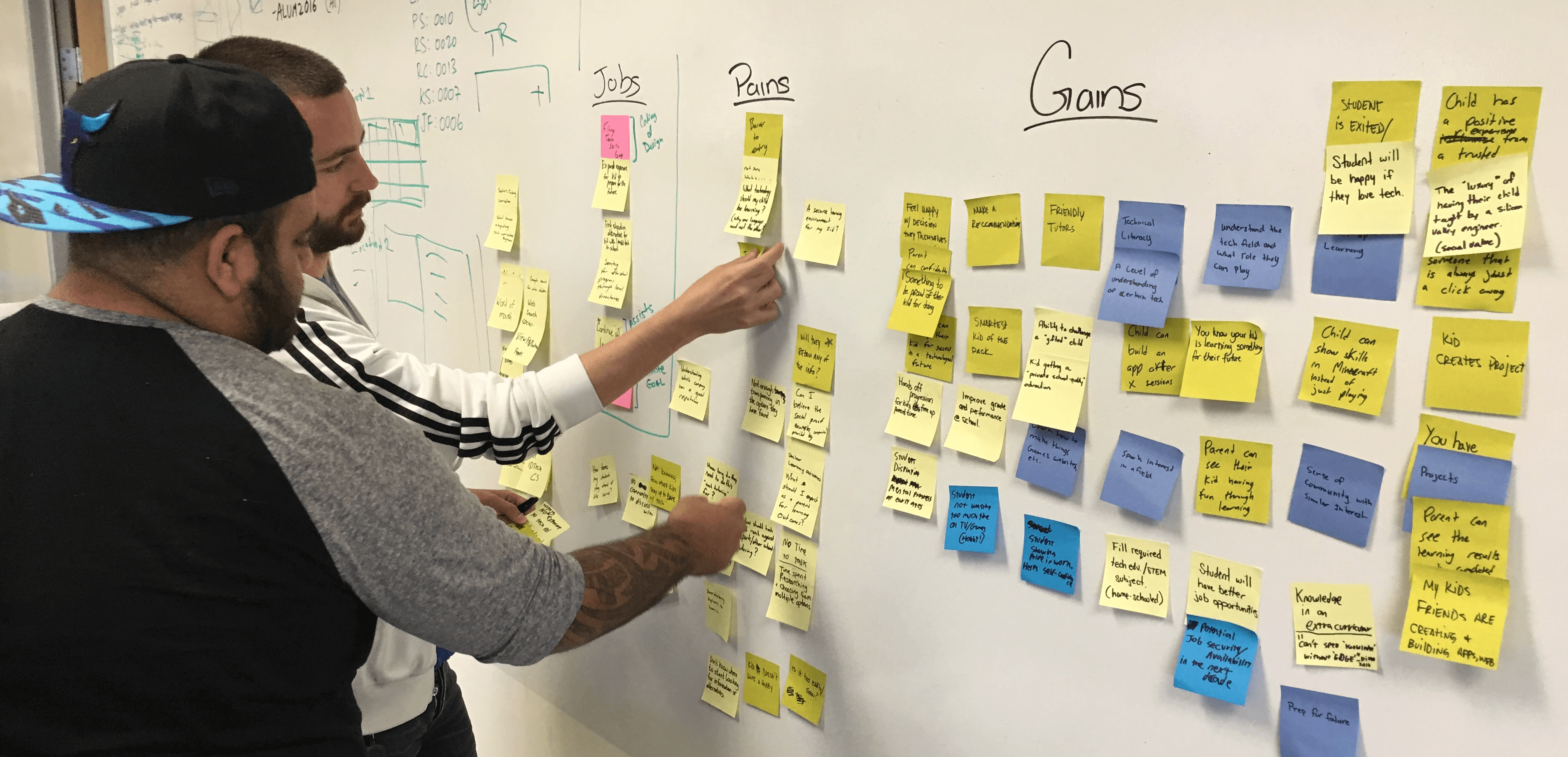
- Conducted Value Prop exercises, spoke with parents at Family Showcase, where family and friends are invited to see the students projects, and listened to conversations with the Client Services team.
- Worked with the Director of PM and Director of Engineering to prioritize projects based on business goals.
- Directed videos and created shot lists for photos to be taken during camp.
- Worked with Illustrator on vision and style for the creative that would be used in the website and marketing collateral.
PROCESS
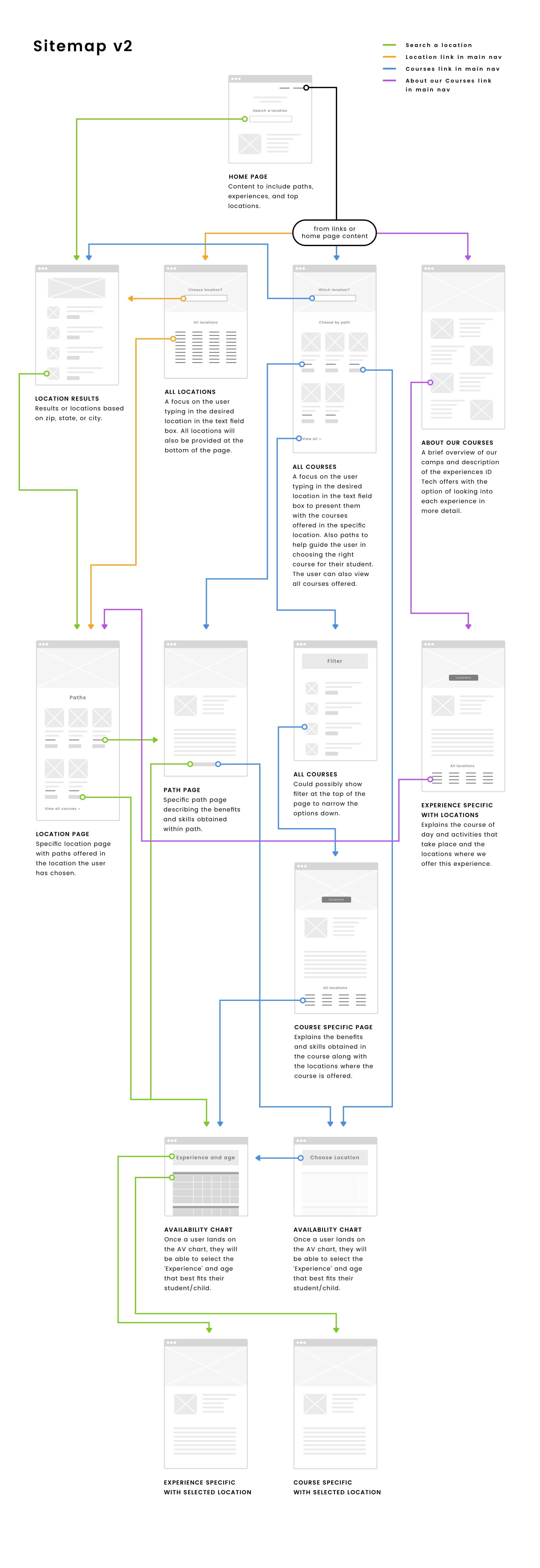
Site Flow
We took a step back to rethink the site structure which allowed us to see which pages were no longer necessary and how to progressively disclose the right information through the course of the users journey.
We looked closely at Client Services call script and decided to base the flow of the pages and our conversational design on it.
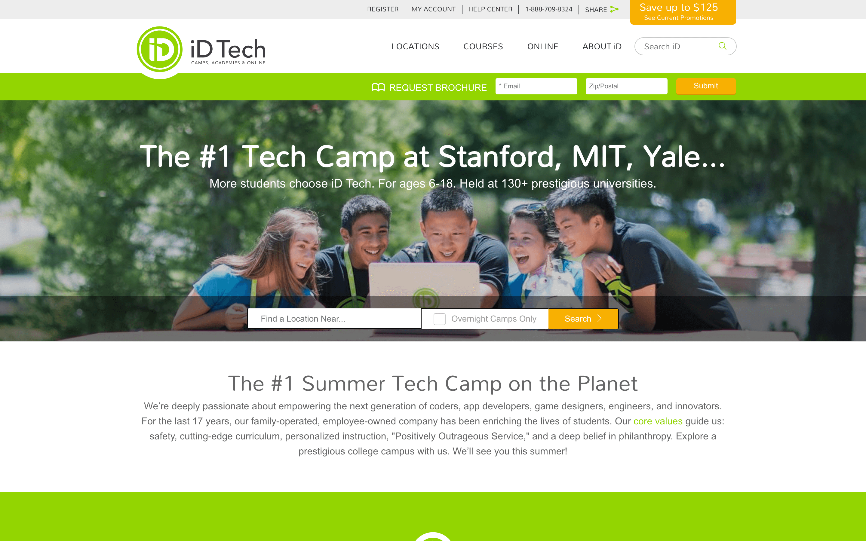
Screenshot of the site before the redesign
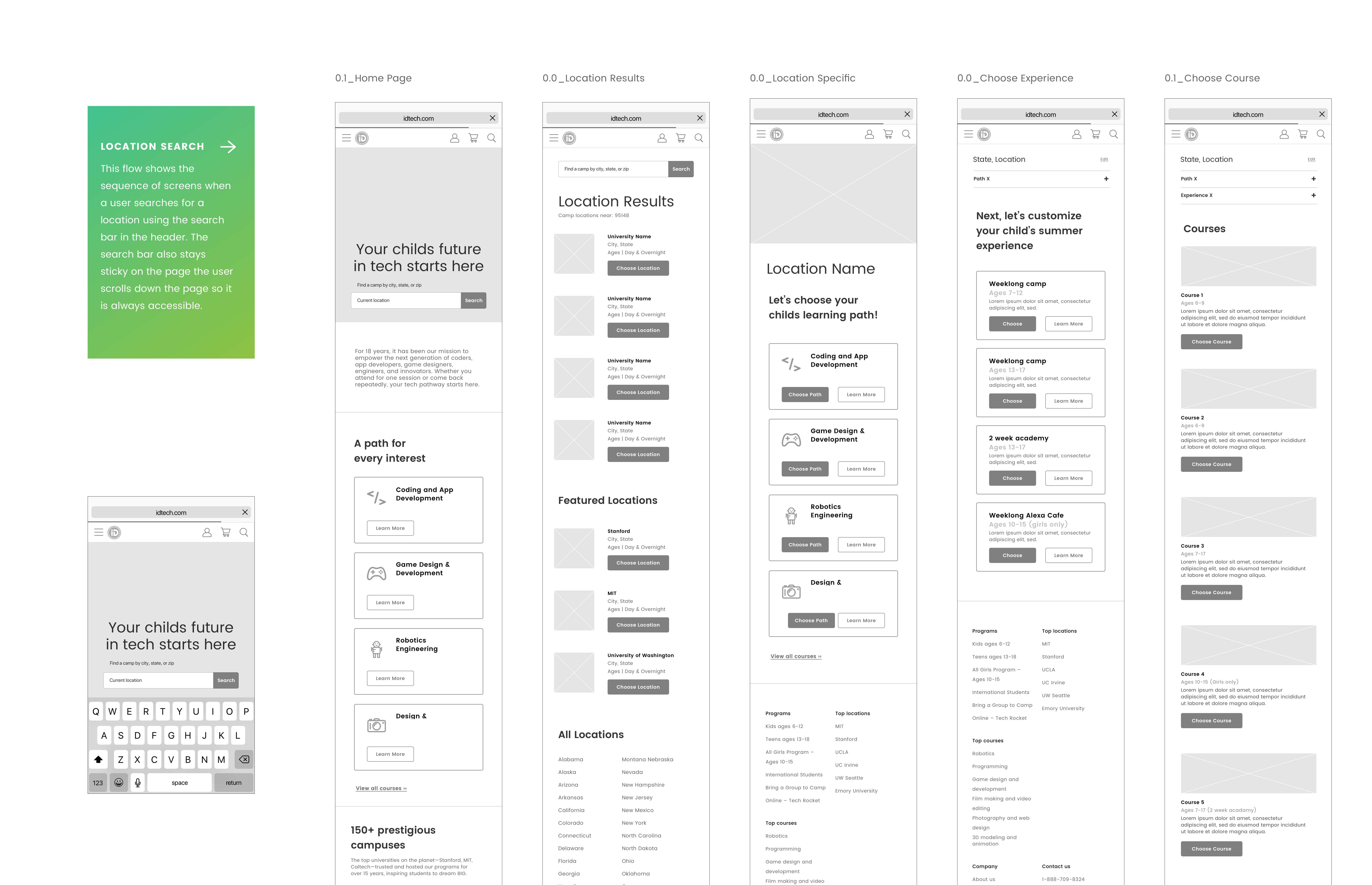
Wireframes
Wireframes
Once we agreed on the new architecture of the site we then created wireframes. The wireframes were printed on large posters and shared thoughout the office so that others would be able to write directly on them and give their feedback. Once we finalized the wireframes we then prototyped the interactions in InVision, gathered feedback and made improvements.
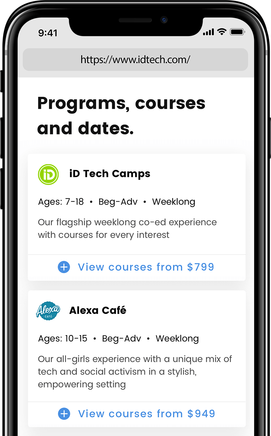
We took the mobile first approach to ensure we were delivering what's essential. If our site was good on a mobile device, it would translate better to all devices.
SOLUTIONS
Solution #1: Complexion reduction
Less clutter with the use of bigger, bolder and blacker headlines. Colors are also used sparingly, with tons of white space.
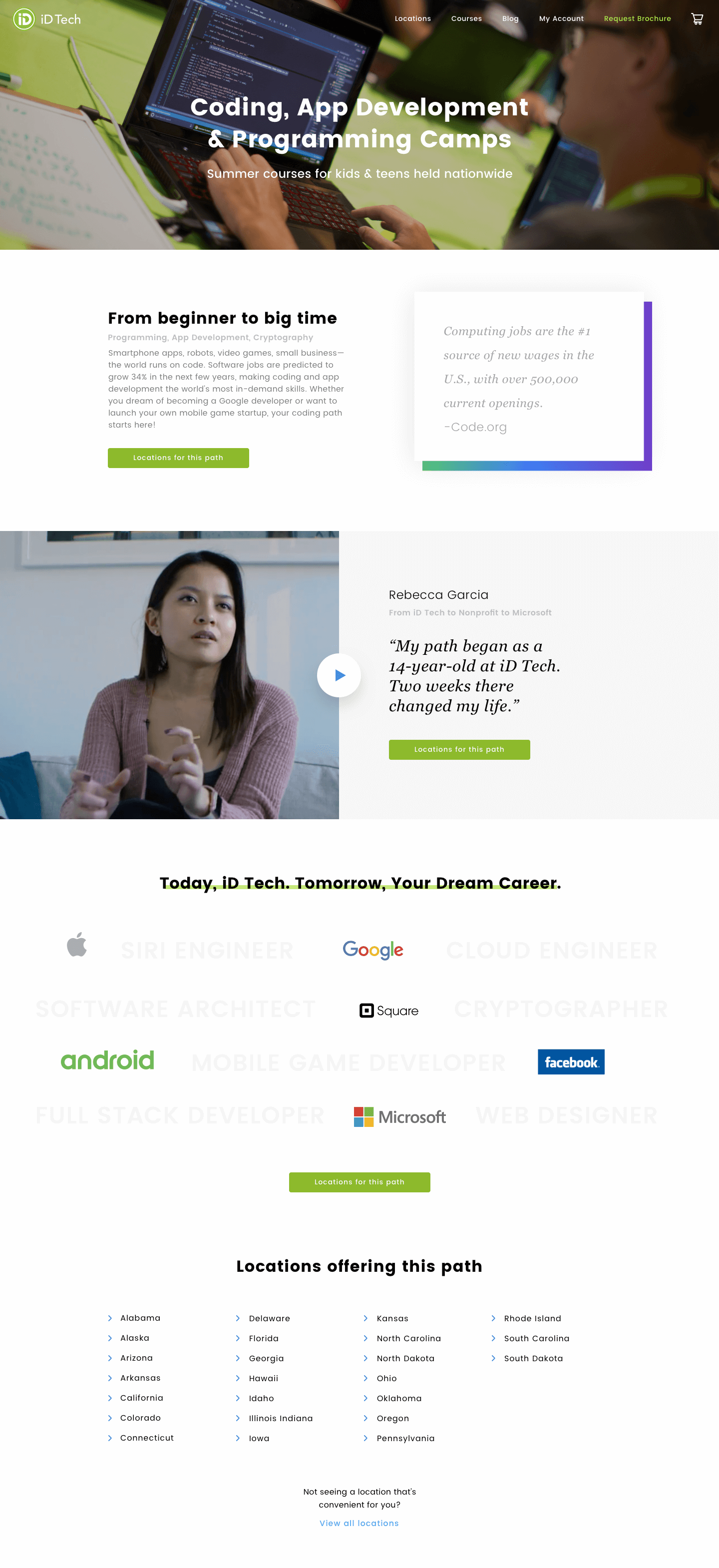
Solution #2: Progressive disclosure
We maintained the focus of a user's attention by reducing clutter, confusion, and cognitive workload. This improves usability by presenting only the minimum data required for the task at hand.
Mobile experience
Mobile experience
We emphasized finding the perfect course based on your location in mobile as simple as possible. Although we iterated on the availability charts multiple times, visitors are able to get to the course availability and purchase very quickly.
Outcomes
Overall, we've increased organic conversion by 23% by clarifying the value prop, allowing the user to register multiple students and courses at once and by improving the legibility of the availability calendar.
The conversion rate on mobile devices was up 11% from previous years.